Walking down the aisles while grocery shopping over the weekend, I realized that a fair amount of companies are simply “QR-ing” wrong. Many of the QR codes I saw were either too big, too small, or way too dense.
QR codes are often used in retail for three main purposes:
- Coupons
- Product information
- Marketing campaigns and promotions
However, when QR codes are too big, too small, or too dense, they’re difficult to scan. If a consumer can’t capture the QR code immediately, they’ll most likely move on and never scan the QR code.
So how can you create the optimal QR code?
Here are 3 tips to create the perfect QR code for a retail environment:
1. Make it the right size
The optimal size for a QR code depends on the distance the customer will be from the code.
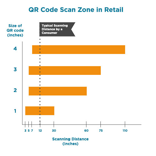
As you can see in the graph to the right, the average consumer will typically scan within 1 foot of the QR code.
A 1-inch QR code covers the most distance within that 1-foot scan zone.
Because of this, the optimal retail QR code should be no smaller and no larger than 1-inch. Some QR codes will be smaller than 1-inch and will still scan, however QR codes at that size are difficult for scanners and smartphones to distinguish between the black squares and white spaces, so the scan usually takes longer than it should.
2. Make it the right density
By density, I mean how close those little black squares and white spaces are to one another.
Next time you’re in the supermarket, take a second to notice all of the QR codes flooding the shelves and displays. Some of them will be made up of larger and fewer black squares than others.
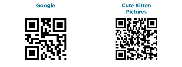
Why is this? The amount of data the QR code holds will determine its density. Take a look at the 2 QR codes below, generated by our free barcode generator. The code labeled “Google” has the simple URL of “Google.com” encoded in it. The code labeled “Cute Kitten Pictures” has the more complex URL of “https://www.google.com/#q=cute+kitten+pictures” encoded in it.
The “Cute Kitten Pictures” QR code is the denser of the two.
The more data encoded, the denser the QR code will become. So as a rule of thumb when using a QR code to bring consumers to a webpage, use short URLs or 301 Redirects for coupon codes, product information, and promotions.
Google has a great URL shortener to get started: https://goo.gl/

3. Keep it black and white
Barcodes are almost always black and white. Why? In order for the scanner or smartphone to scan quickly and accurately, there needs to be a strong contrast between the bars/squares and spaces. You can’t create more contrast than black and white!
Every now and then you’ll see a QR code in color. While it may look pretty and go nicely with the surrounding content, there’s less of a contrast, so the scanner or smartphone will take longer to recognize and decode it.
There you have it. Follow these tips and you’ll have the perfect, optimal QR code for your next label, coupon, or promotion. If you’re in need of a QR code, or any other barcode for that matter, we have a free barcode generator you can use. If you’re in need of a more complex and variable barcoding solution, I suggest you take a look at our Barcode Labeling Solution Page for more information or email us for more information at info@L-Tron.com.
About the author:

Jason Shanley is L-Tron’s Content Creator & Creative Design Specialist and often writes about Zebra Technologies, mPOS, mobile computers, and 2D barcodes in retail. Jason believes everything can be fixed with tape and plays volleyball on Tuesdays. He can be reached at jason.shanley@L-Tron.com or (800) 830-9523 ext 115.


